Pagina's

zaterdag 24 juni 2017

Ballonnen - Balloons

(Please scroll down for English)

Tijd voor een kinderkaart. Dat is altijd zoeken naar een evenwicht - ik wil er natuurlijk kalligrafie op, maar voor jonge oogjes moet het ook speels blijven. Ik heb me laten inspireren door Pinterest en een vrolijke ballonnenkaart met lettertjes gemaakt.


De ballonnen heb ik uit restjes papier geknipt en op verschillende hoogtes geplakt. Het achtergrondje is een staaltje behangpapier, dus ik doe ook weer aan upcycling. Op de banner onderaan heb ik getekende kapitalen gebruikt, in de ballonnen zelf heb ik voor handlettering gekozen. Nog een detailfoto van de lettertjes in de ballonnen:


Time for a card for a child. It's always a bit difficult to find the right balance - of course I want calligraphy on it, but it needs to be playful too. I was inspired by a card on Pinterest and made a cheerful balloon card with lettering.

I cut the balloons out of paper scraps. The background is a sample of wallpaper, so I did some upcycling again. On the banner I used drawn capitals and in the balloons I chose hand lettering. 

zaterdag 17 juni 2017

Geluk - Happiness

(Please scroll down for English)

Vandaag toon ik een verjaardagskaartje met alweer... Neuland-letters. Deze keer wel in combinatie met kabouterletters.

Tekst: Kris Gelaude

Toen de kaart al bij de bestemmeling was en ik de foto nog eens bekeek, heb ik beseft dat ik helemaal vergeten ben er op het einde nog de auteur onder te zetten (daar was de witte ruimte onderaan voor bedoeld - oeps). Bij deze dus: de tekst is van Kris Gelaude.

De Neuland-letters heb ik als decoratief element gebruikt bij deze mooie verjaardagswens. Ik heb de letters eerst zeer licht in potlood getekend en daarrond een contourlijntje in Neocolors II (de wateroplosbare) gezet. Vervolgens heb ik de Neocolors met water doen uitlopen voor het aquareleffect. Net als de kleurige puntjes in mijn vorige post is dit ook geen idee van mezelf, maar heb ik het uit een boek. Het komt van Roann Mathias en is beschreven in het boek More Creative Lettering van Jenny Doh. Ook dit boek is een aanrader voor wie graag creatief bezig is met letters.

Today I am showing you a birthday card with again... Neuland lettering. This time, I combined them with gnomes' letters.

When this card had already reached its destination I looked at the picture and realised that I totally forgot to add the name of the author. That's why there is so much white space under the poem... It's written by Kris Gelaude, by the way.

I used Neuland letters to decorate this birthday poem. It says more or less "I wish you happiness with a golden ribbon around it". "Geluk" is the Dutch word for happiness. I first wrote the letters in pencil, very lightly and then outlined the letters with Neocolor II (the water-soluble ones). Then I blended the colour with a wet paintbrush to get the watercolour look. Just like the dotted letters in my previous post, I did not invent this myself. The idea is from Roann Mathias and I found it in the book More Creative Lettering by Jenny Doh. Again a book that I can recommend if you like being creative with letters.

zaterdag 3 juni 2017

Pop-upnaam #2 - Pop-up Name #2

(Please scroll down for English)

Vandaag toon ik twee kaartjes die ik al een tijdje geleden gemaakt heb. In het voorjaar was ik helemaal in de ban van pop-upkaarten. (Als je geheugen je even in de steek laat, klik dan hier, hier en hier.) Ik heb eerder ook al geschreven dat ik eindelijk begonnen ben aan de Neuland-letter (zie hier). Een combinatie van beide moest er dus eens van komen...


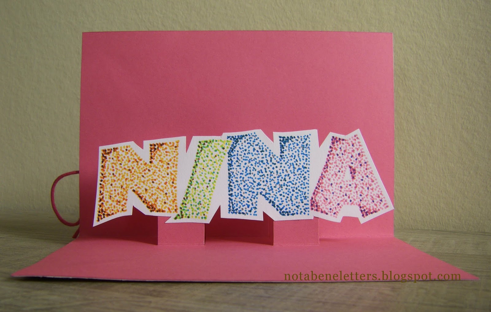
Voor twee jarige dames heb ik gelijkaardige "naamkaartjes" gemaakt. Eerst de naam in potlood uitgeschreven in getekende Neuland en die vervolgens gevuld met heel veel puntjes in verschillende kleuren. Respect voor de pointillisten. Wat een geduld moeten die schilders gehad hebben!


De puntjestechniek heb ik geleerd uit het boek Decoratief letteren van Jan Pickett. Dat is een van de recentere boeken over kalligrafie. Ik ben altijd blij als er zo'n hedendaags boek over kalligrafie verschijnt. Het surft ongetwijfeld mee op de huidige populariteit van handlettering, maar dit gaat dus wel over de klassieke kalligrafie - weliswaar met heel veel eigentijdse creatieve toepassingen. Helemaal mijn ding dus.

Vervolgens heb ik de namen uitgeknipt en op een simpel zelfgetekend pop-upmechanisme geplakt. Aan de buitenkant heb ik het heel eenvoudig gehouden: dessinpapier (geüpcyclede behangstaaltjes) met een lintje erdoor voor een feestelijk tintje.


Je ziet het: de kaarten zien er zo eigenlijk een beetje saai en vooral heel vreemd uit. Ik hoop dat dat de verrassing des te groter maakt als de ontvanger de kaart opent en de gepersonaliseerde binnenkant ziet.

Today I am showing you two cards I already made a while ago. In spring I was totally into pop-up cards. (If you don't remember all the details, click here, here and here.) I already told you I started learning Neuland (see here). Combining both was the logical next step.

For two ladies' birthdays I made similar "name cards". I first wrote the name in pencil in drawn Neuland en filled it with many dots in several colours. Oh, those pointillist painters must have been so patient!

I learned the dotted technique from the book Decorative Lettering by Jan Pickett. It's a quite recent book about calligraphy and I am always happy to find a book about contemporary calligraphy. I'm sure it's thanks to the popularity of hand lettering this can be found in the bookshop now, but it is however about classic calligraphy - but with many creative and modern techniques. That's exactly the thing I like!

After writing and colouring the names, I cut them out and sticked them onto a very simple self-made pop-up mechanism. On the outside the cards are very simple: just patterned paper (upcycled wallpaper samples) with a bow for a festive look. 

As you can see, the cards look rather boring and a bit strange on the outside. I hope that made an even bigger surprise when opening them and seeing the very personal inside.